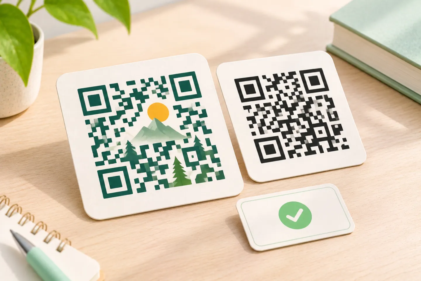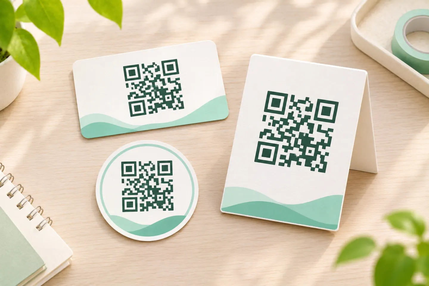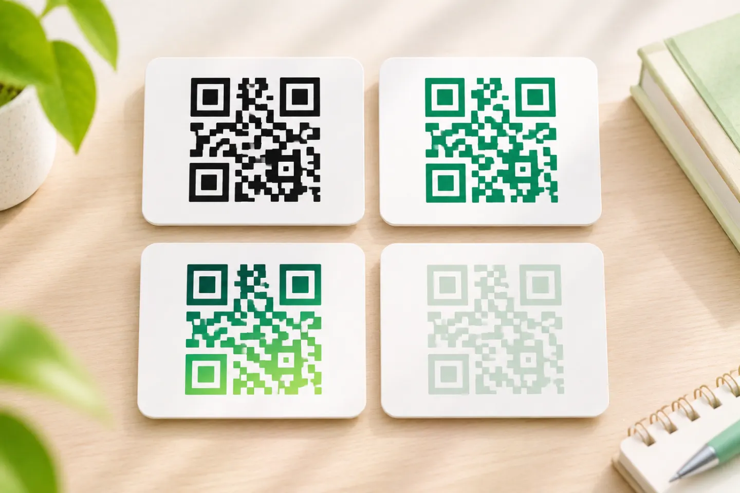


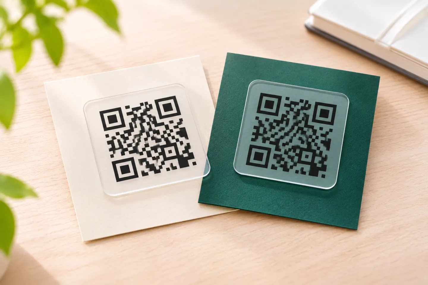
The conservative design approach is to keep the QR marks fully opaque and dark, place them against a plain light background, and preserve the surrounding quiet zone. DENSO WAVE specifies a four-module margin on every side of a standard QR Code; GS1 recommends strong separation between dark and light elements. [2]
What does a transparent QR code mean?
For this guide, a transparent QR code means artwork with opaque QR marks and a transparent background. That is different from reducing the opacity of the entire image. PNG supports both fully transparent and partially transparent pixels; partial opacity blends the foreground with whatever is underneath. [1]
Distinguish three design choices:
- Transparent background: The layout beneath supplies the visible background, including the light spaces between dark modules.
- Faded QR marks: The marks themselves blend with the background. Avoid this as a default design choice.
- Transparent surroundings with an opaque backing: The outer layout stays visible, but a light panel protects the complete QR area.
These distinctions follow from how transparency composites images. They are not separate QR encoding formats. [1]
Preserve a four-module quiet zone
A module is one small square in the QR grid. A standard QR Code needs a clear margin at least four modules wide on all four sides. This margin is additional to the encoded symbol, not space you can take from its outer rows. [2]
For example, if each module measures 0.5 mm, reserve at least 2 mm of clear space on each side. That is an illustration of the margin rule—not a recommended minimum module size. [2]
In a transparent layout, reserve that space in the underlying design. Do not let a photograph, headline, border, or decorative shape show through the margin. Transparent pixels do not create a clear quiet zone by themselves; this is a practical consequence of the transparency model and DENSO WAVE’s margin requirement. [1]
Choose the placement before removing the background
Use these as conservative design decisions, not predictions of scan success:
| Placement | Recommended approach |
|---|---|
| Plain white or light-colored panel | Consider transparency, while keeping the marks dark and the margin clear. |
| Photograph, texture, or changing gradient | Add an opaque light backing instead of relying on the image beneath. |
| Dark page or package | Prefer a light backing with dark marks rather than automatically switching to an inverted design. |
| Clear label, window, or transparent packaging | Plan an opaque white area beneath the code and its margin. |
These recommendations apply the contrast and quiet-zone guidance conservatively. For transparent packaging specifically, GS1 warns that the contents can change barcode contrast and recommends a matte, opaque white area beneath a black barcode. Its guidance addresses physical substrates; applying the same backing-panel idea to digital artwork is an editorial recommendation. [2]
A practical design and export workflow
1. Keep the functional marks opaque
Use black as the starting point. If you introduce a brand color, retain strong separation from the background. Do not lower the whole QR layer’s opacity just to make it less visually prominent; partial opacity changes the resulting colors. [3]
2. Export with transparency intentionally
If your design tool supports it, export a PNG with a transparent background while retaining opaque marks. PNG supports transparency, but a PNG file can also be completely opaque—confirm the actual export rather than relying on the extension. No particular generator’s export controls are assumed here. [1]
3. Check the complete QR footprint
Measure the four-module margin on every side after placement. If you add a backing panel, make it large enough to protect that margin as well as the symbol. Keep borders and calls to action outside it. [2]
4. Avoid shrinking to a universal minimum
DENSO WAVE says module size should be selected for the application and that larger modules are easier for scanners to read. Do not treat one pixel width or print dimension as suitable for every destination, printer, and scanning distance. [4]
5. Validate the final output
Recommended checks before release:
- Scan the finished layout at its intended display or print size, not just the source image.
- Use more than one representative phone or scanning application.
- Check expected lighting, distance, and viewing angles.
- For print, inspect a production-representative sample on the intended material.
- Confirm that the decoded destination is correct.
These are proposed checks, not tests performed for this article. For production barcode quality assessment, GS1 recommends a barcode verifier; a successful phone scan is not the same assessment. [3]
Is a 3:1 contrast ratio enough?
Do not use WCAG’s 3:1 ratio as a QR scanning threshold. W3C’s non-text contrast guidance concerns people distinguishing applicable interface components and meaningful graphics. It does not establish a machine-decoding threshold for QR codes. [5]
For barcode production, use barcode-specific guidance and final-output assessment rather than treating a web accessibility contrast result as proof of scannability. [3]
References
[1] W3C, Portable Network Graphics (PNG) Specification (Third Edition), Sections 6.2 and 13.16 — https://www.w3.org/TR/png/
[2] DENSO WAVE, Point for determining the code area — https://www.qrcode.com/en/howto/code.html
[3] GS1, GS1 2D Barcode Colour & Quality Guide, Release 1.0, February 2025 — https://ref.gs1.org/docs/2025/GS1-2D-colour-guide-i10-f-25-02-10
[4] DENSO WAVE, Point for setting the module size — https://www.qrcode.com/en/howto/cell.html
[5] W3C WAI, Understanding Success Criterion 1.4.11: Non-text Contrast — https://www.w3.org/WAI/WCAG22/Understanding/non-text-contrast