


Use the table below to decide which layout details to fix across campaigns.
Define what stays consistent—and what can change
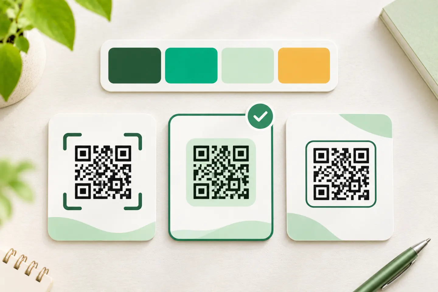
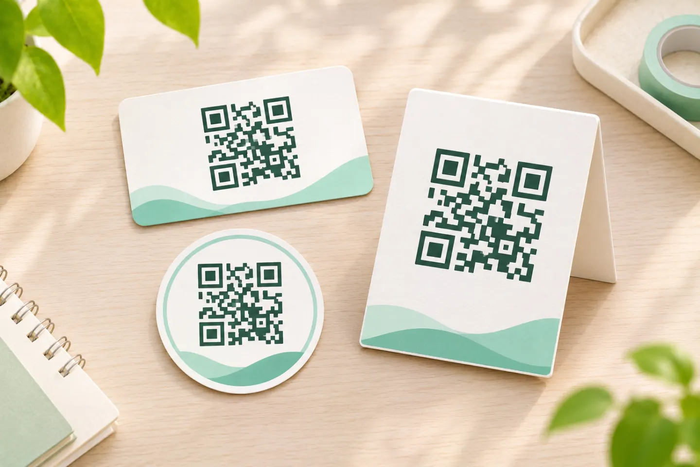
Treat the QR treatment as a reusable layout component, not a newly decorated code for every campaign. The following is a suggested design-system specification, rather than a technical standard:
| Element | Standardize | Allow to change |
|---|---|---|
| Outer container | Shape, padding, border treatment | Approved campaign color |
| Code panel | Light background, protected margin | Size appropriate to the placement |
| Typography | Font family, hierarchy, alignment | CTA wording and line length |
| Logo | Position outside the code | Approved brand or partner lockup |
| CTA | Placement and writing style | Specific action or destination |
| Production record | Required approval fields | Destination, artwork version, test results |
For a real-world example, Brand Northern Ireland’s guidelines place a black QR code in a white rounded box within a hexagonal graphic, with a nearby CTA. That is one organization’s visual system—not a requirement to make every branded code hexagonal. [3]
Protect the technical boundaries
ISO/IEC 18004:2024 specifies QR code characteristics, encoding, dimensional characteristics, error correction, and production quality requirements. Its public abstract establishes that technical scope; it does not endorse particular decorative treatments. [4]
Keep a four-module quiet zone
A module is one small square in the QR grid. A standard QR code needs an empty margin at least four modules wide on all four sides. Keep text, logos, frame edges, and decorative patterns outside that area. [1]
For your template, distinguish three layers:
- The code grid: the encoded symbol itself.
- The quiet zone: the protected empty margin around it.
- Brand padding: any extra space before the surrounding frame or text.
Do not count decorative padding as a substitute for the required quiet zone. Keep the quiet zone the same color as the code’s light background; GS1 identifies that as the safest treatment. [5]
Use a conservative color default
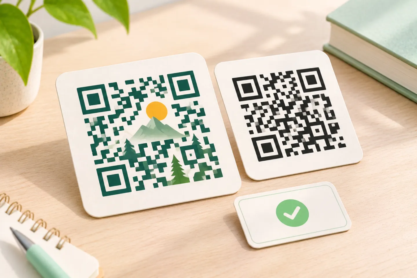
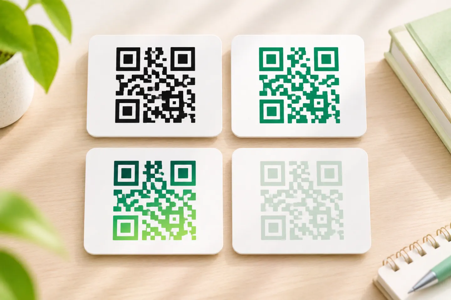
Make black on white your baseline. If brand color is important, put it in the outer container first. GS1 recommends black-and-white contrast for the modules, background, and quiet zone. Its color guidance also cautions against gradients and explains that reflective or transparent materials introduce scanning challenges. [5]
As an editorial template policy, require additional approval for colored modules, inverted colors, or non-solid backgrounds. Do not approve a combination solely because it looks high-contrast on a designer’s monitor.
Preserve the grid and locating patterns
Keep the QR code square; do not stretch it to fit a layout. Avoid turning its modules or corner patterns into decorative artwork. GS1’s retail implementation guidance explains that distorted finder patterns and altered module shapes can make decoding more difficult. [2]
Prefer an adjacent logo over an embedded logo
A branded QR code does not need a logo in its center. Place your logo above, below, or beside the protected code panel as the default.
GS1 explains that an overlaid logo blocks encoded information and is technically treated as damage. Error correction may allow recovery, but intentionally using that capacity leaves less resilience for subsequent damage. A misplaced overlay can also interfere with essential fixed patterns. [6]
There is no universally safe logo percentage established by the sources reviewed here. Error-correction percentages describe restoration relative to codewords, not a guaranteed percentage of the visible square that can be covered. Higher error correction also increases data overhead and can require a larger symbol. [7]
If an embedded logo is a firm requirement, treat each final code as an exception requiring its own assessment—not as a reusable promise that every destination will scan.
Make the CTA part of the visual system
Use the same font, alignment, and spacing rules across placements, but write the CTA for the actual destination. Suggested examples include:
- View the menu
- Register for the event
- Read the setup guide
- Explore product details
Prefer a specific action over a vague “Scan me.” Put the CTA outside the quiet zone.
For QR Codes powered by GS1, GS1’s branding guide explicitly requires CTA text outside the quiet zone and away from the GTIN or other human-readable information. That guide applies specifically to QR Codes powered by GS1 with GS1 Digital Link inside; its GS1 label and typography instructions are not general branding rules. [8]
Set sizes by placement—not one universal minimum
Do not put a single “minimum QR size” in your brand guide without conditions. DENSO WAVE explains that physical size depends on the symbol version and module size, and that printer capabilities and scanner resolution both matter. [9]
Instead, maintain separate approved templates for hand-held print, packaging, signage, and screens. Record:
- The code width, specifying whether it includes the quiet zone.
- The intended viewing distance and medium.
- The final material or display conditions.
- The artwork version and evidence of testing.
Approve sizes for the intended use rather than copying another organization’s leaflet or TV recommendations. For retail point-of-sale codes, use the applicable GS1 sizing and quality requirements; a successful consumer-phone scan does not establish retail suitability. [2]
Use a repeatable production and approval workflow
The following is a recommended editorial workflow, not a report of testing performed for this article:
- Confirm the destination. Check that the encoded address and CTA agree.
- Apply the master template. Keep the logo, CTA, and frame outside the protected code area.
- Inspect the final export. Check for cropping, stretching, missing margins, or unintended backgrounds.
- Test the actual placement. Use a final-size print proof or intended display, not only an enlarged preview. Try representative phones, viewing distances, angles, and lighting.
- Record the outcome. Save the artwork, destination, device details, conditions, and failures—not merely “tested.”
- Recheck changed versions. Require a fresh approval when the destination payload, code design, size, or production material changes.
For modified barcodes used at retail POS, GS1 calls for verification of each unique barcode against ISO/IEC 15415 and the relevant symbology standard. Casual phone testing is not a substitute for that process. [2]
A useful brand guideline therefore contains more than an attractive example: it defines protected space, permitted variations, and an approval process. Keep the visual language consistent while validating each final code for its actual use.
References
[1] DENSO WAVE. Point for determining the code area — https://www.qrcode.com/en/howto/code.html
[2] GS1. 2D Barcodes at Retail Point-of-Sale Implementation Guideline, Release 1.1 — https://ref.gs1.org/guidelines/2d-in-retail/1.1.0/
[3] Invest Northern Ireland. Brand Northern Ireland Guidelines, Section 11, p. 59 — https://www.investni.com/sites/default/files/2025-11/invest-ni-brand-ni-guidelines.pdf
[4] ISO. ISO/IEC 18004:2024 — QR code bar code symbology specification (public abstract) — https://www.iso.org/standard/83389.html
[5] GS1. Is it important for the quiet zone of a 2D barcode to have a good contrast to the dark modules? — https://support.gs1.org/support/solutions/articles/43000748158-is-it-important-for-the-quiet-zone-of-a-2d-barcode-to-have-a-good-contrast-to-the-dark-modules-of-the
[6] GS1. 2D Barcode Colour & Quality Guide, Release 1.0, February 2025 — https://ref.gs1.org/docs/2025/GS1-2D-colour-guide-i10-f-25-02-10
[7] DENSO WAVE. Error correction feature — https://www.qrcode.com/en/about/error_correction.html
[8] GS1. QR Codes powered by GS1 design guidelines, Version 1.1, October 2024 — https://assets.ctfassets.net/9uypwcnuzbqi/5tdVjyVX7zyEgOrvxiG1Ov/981cd49e750e2d24539ef0279f41ac9d/24GSGL0599_D01_QR_Brand_Guidelines_V1-1_External.pdf
[9] DENSO WAVE. Point for setting the module size — https://www.qrcode.com/en/howto/cell.html