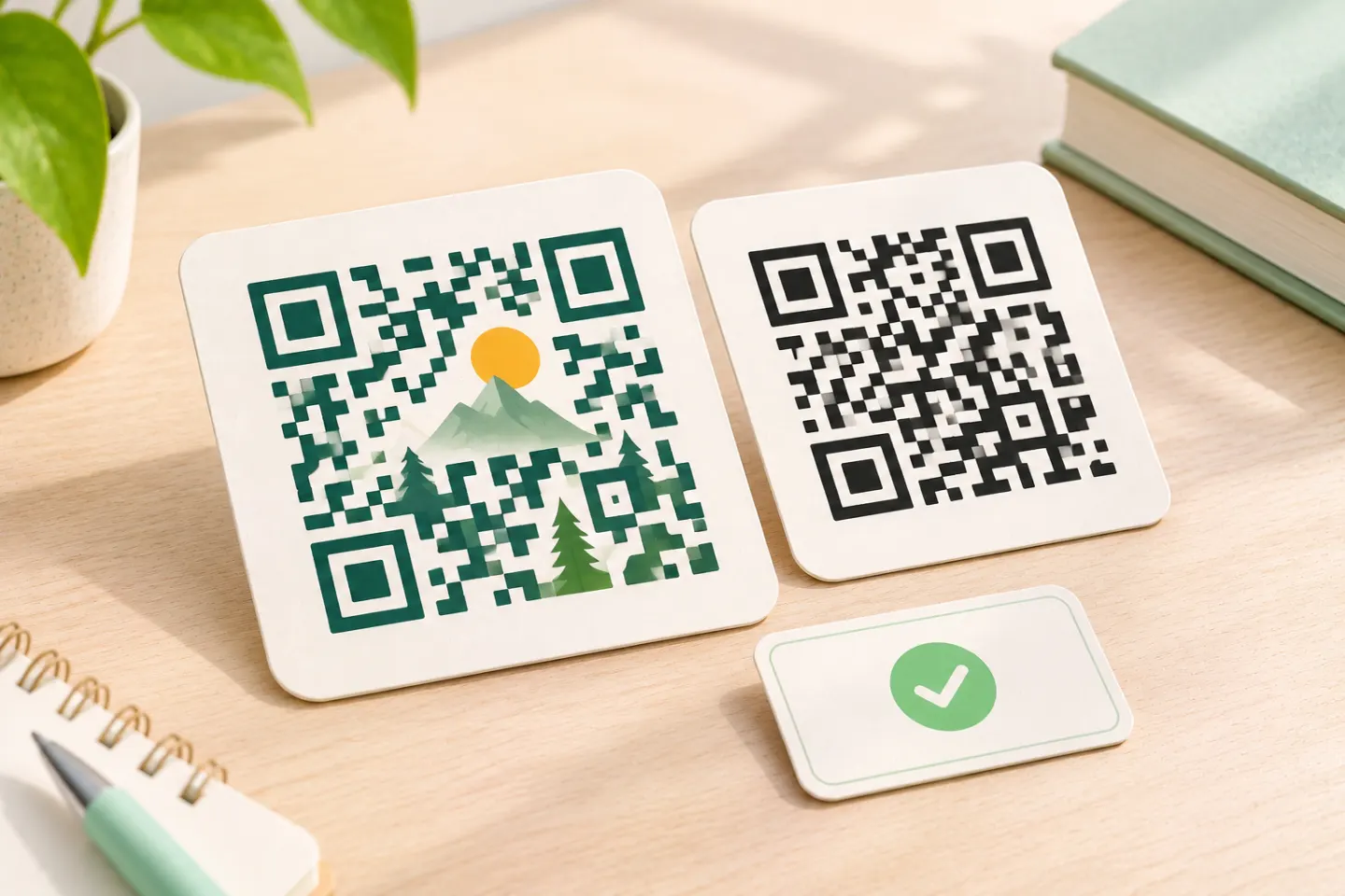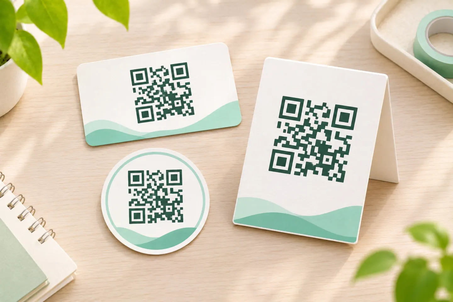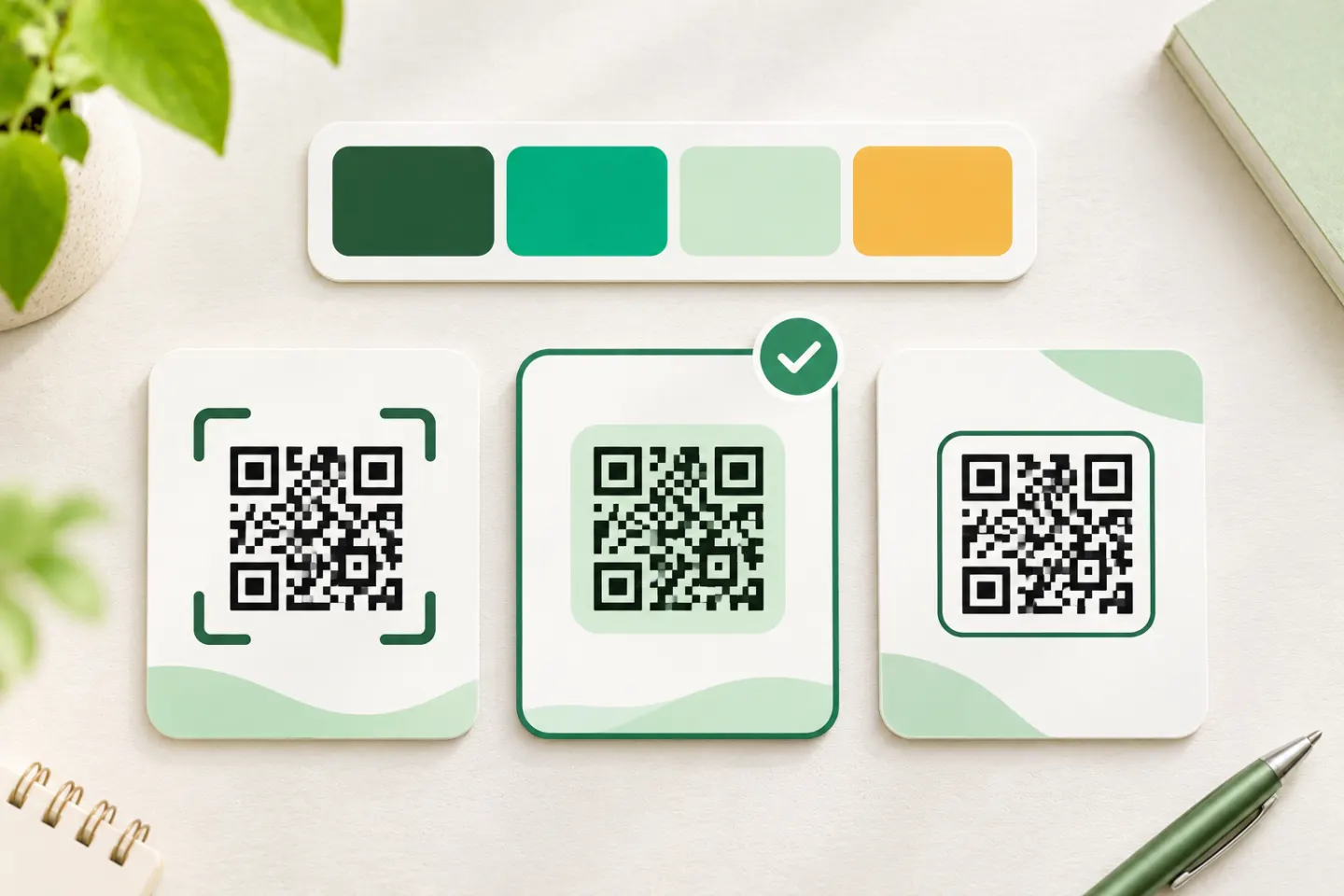


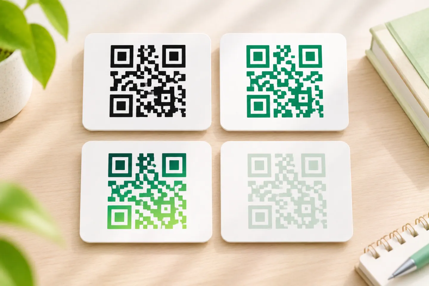
For a practical starting point, use dark modules—the small squares that form the code—on a light background. GS1 Finland identifies black on white as the safest combination and stresses that alternative colors must remain distinguishable under the intended lighting. [2]
Which QR code colors should you choose?
Use this table to narrow the design, not to approve a finished barcode:
| Color treatment | Practical decision |
|---|---|
| Black on white | Recommended default. |
| Dark blue, dark green, or dark brown on white | Candidates for a branded version; test the finished output. |
| Red, orange, or yellow modules on white | Avoid as the default, especially for red-illuminated scanners. |
| Similar light and dark shades, or gradients | Avoid; the distinction between modules and background can become unclear. |
| White modules on a dark background | Possible as a reverse-reflectance design, but validate it for the intended readers. |
These choices follow DENSO WAVE’s black-on-white recommendation and GS1’s color guidance; they are not results of QRHyper device or print testing. [1]
Why red can work on a phone but fail at checkout
Not every QR reader uses red illumination. GS1 distinguishes red-illuminated retail scanners from smartphones using ambient or white light. Under red illumination, red modules can look too similar to a white background, even when a phone can decode the same design. That is why a successful phone scan does not establish retail compatibility. [3]
Check contrast with the intended reader
Use a plain black-on-white code as your control. A colored code that works with a phone can still fail on an illuminated retail scanner. For retail production, use the applicable barcode verification method. [3][4]
Keep the clear margin—not necessarily a white border
A standard QR Code needs a quiet zone at least four modules wide on every side. Measure it using the width of one small module, not the larger corner squares. DENSO WAVE describes this as a clear margin around the symbol. [5]
The margin does not have to be white merely because it is a quiet zone. GS1 recommends keeping it the same color as the code’s background, with good contrast against the modules. For a dark code on a light background, continue that light background through the margin and keep text, frames, and graphics outside it. [6]
Change the color without redesigning the pattern
Keep the square grid and the three large corner finder patterns intact. GS1 warns that altered module shapes and distorted patterns can make decoding harder. It also treats an overlaid logo as damage to the encoded symbol, even when error correction allows the code to remain readable. [4]
Our recommendation: approve a plain, single-color version first. Treat a logo, gradient, or decorative module shape as a separate design change requiring another review—not as an automatically safe addition.
How to check a colored QR code before publishing
Use this workflow as a release checklist. It is a recommended process, not a report of tests performed for this article.
- Choose a baseline. Keep a black-on-white version alongside the colored candidate. DENSO WAVE recommends that baseline and experimentation with colored codes. [1]
- Inspect the final layout. Check the exported artwork for an intact grid, unobstructed finder patterns, and the full four-module margin. [4]
- Test the actual output. Use a final-size printed sample or the intended screen placement—not only an enlarged design preview. For transparent packaging, include an opaque white backing rather than assuming the contents will provide a stable background; DENSO WAVE warns that transparency and glare complicate reading. [1]
- Test the intended readers. For a consumer campaign, try multiple representative phones. For checkout, include the relevant retail equipment; phone and POS illumination differ. Record the artwork version, device, lighting, and any failures. [2]
- Separate scanning from verification. For modified GS1 retail barcodes, arrange formal barcode verification. GS1 calls for each unique modified barcode to be verified against the relevant requirements; a phone scan is not that quality assessment. [4]
References
[1] DENSO WAVE, “FAQ,” including colored printing and transparent-material guidance — https://www.qrcode.com/en/faq.html
[2] GS1 Finland, “How to barcode a product,” section 5 — https://gs1.fi/en/barcodes/how-barcode-product
[3] GS1, GS1 2D Barcode Colour & Quality Guide, Release 1.0, February 2025, especially sections 2.3 and 3 — https://ref.gs1.org/docs/2025/GS1-2D-colour-guide-i10-f-25-02-10
[4] GS1, 2D Barcodes at Retail Point-of-Sale Implementation Guideline, Release 1.1.0, ratified December 2025, section 4.6.5 — https://ref.gs1.org/guidelines/2d-in-retail/
[5] DENSO WAVE, “Point for determining the code area.” — https://www.qrcode.com/en/howto/code.html
[6] GS1 GO, “Is it important for the quiet zone of a 2D barcode to have a good contrast to the dark modules of the 2D barcode?” — https://support.gs1.org/support/solutions/articles/43000748158-is-it-important-for-the-quiet-zone-of-a-2d-barcode-to-have-a-good-contrast-to-the-dark-modules-of-the