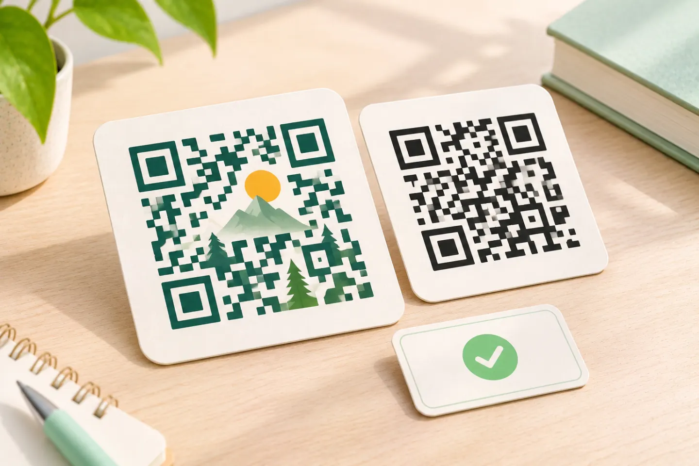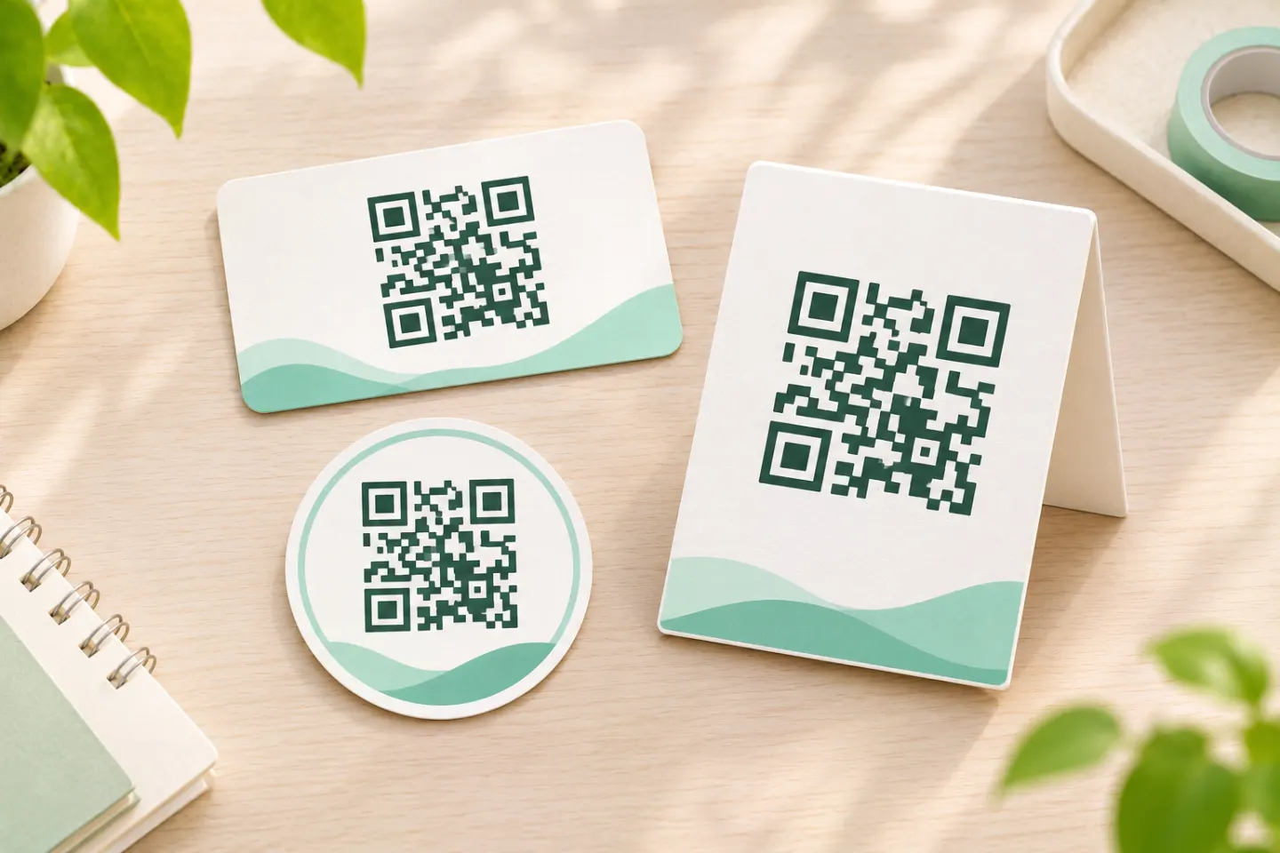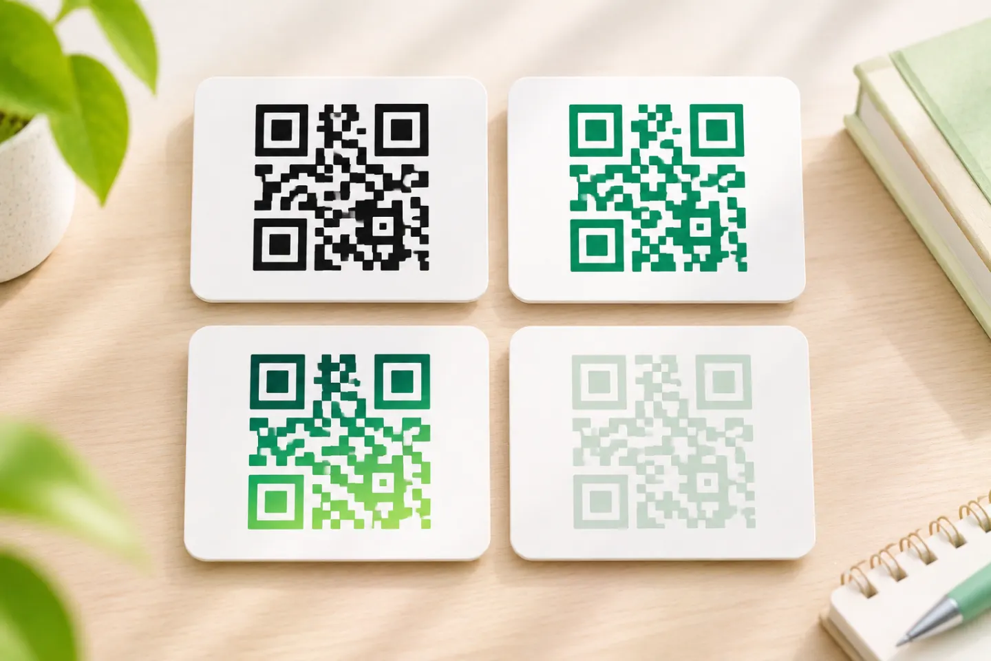


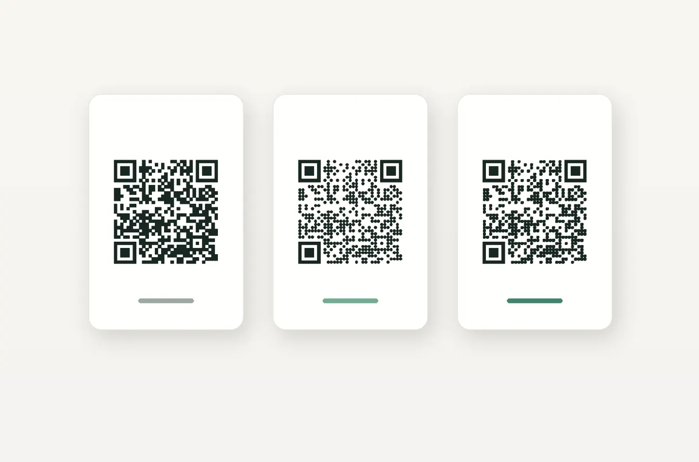
For a conservative starting point, keep the corner markers conventional, preserve the square grid, and put decorative shapes outside the required blank margin. Treat more ambitious styling as a design to validate, not a guaranteed upgrade.
What does “round QR code” mean?
Three different changes can produce a rounded look:
- Rounded or dotted modules: The small dark cells are drawn with softened corners or circles.
- Rounded corner markers: The three large finder patterns are given a different appearance.
- A circular frame or sticker: The surrounding artwork is round while the QR symbol inside remains square.
The first two are rendering options documented by tools such as QuickChart. The third is a layout choice: the artwork must leave room for the complete symbol and its clear margin. [1]
ISO/IEC 18004:2024 describes the conventional QR symbol as nominally square modules arranged in an overall square pattern, with finder patterns at three corners. A styling control is therefore not proof that every output meets the standard or works across readers. [2]
Which parts can you customize?
Data modules: rounded corners or dots
QuickChart documents square, dot, and rounded data-module styles. That confirms these effects are technically available—not that every dot size, output size, and color combination is equally readable. Its documentation specifically warns that heavy styling can be harder to read at small sizes or with low contrast. [1]
Our recommendation: begin with a plain code, change only the module style, and compare the final-size results before adding other effects. Do not manually move or delete cells to improve the silhouette.
Finder patterns: possible to style, better to preserve
The three large corner markers help readers locate the symbol and determine its size and inclination. They are functional structures, not simply decorative corners. [2]
Some software exposes separate outer-finder and inner-dot controls. Nevertheless, GS1 warns that modifying finder patterns can make identification and decoding difficult. For a conservative design, leave these markers square—especially when you are already changing the data modules. [1]
Colors: prioritize readable contrast
Use black on white as your baseline. GS1 identifies it as the best color combination for consistent barcode reading. If brand colors are necessary, compare them against that baseline rather than judging contrast by appearance alone. [3]
For transparent artwork, inspect the actual background in the finished layout. Our recommendation is a solid white panel behind the complete code and margin rather than relying on whatever appears underneath.
Frames and custom outlines: decorate outside the code
A round sticker does not require a circular QR matrix. Keep the complete square symbol inside the sticker, then place borders, lettering, and illustrations beyond its quiet zone. DENSO WAVE specifies a clear margin four modules wide on every side. [4]
For a heart-shaped badge, use the same approach: fit an intact square code and its margin inside the badge instead of cutting the code into a heart.
What must stay intact?
Preserve a four-module quiet zone
A module is one grid cell. The quiet zone is the clear space surrounding the symbol, and conventional QR codes require four module widths on all four sides. It is not merely an optional border setting. [4]
Example: If the module pitch—the spacing from one cell position to the next—is 0.5 mm, reserve at least 2 mm of clear space along each side. Measure from the square symbol boundary, not from the edge of the surrounding sticker. This is a worked example of the four-module rule, not a universal print-size recommendation. [4]
Keep the grid square and complete
Do not stretch the symbol into an oval, crop its corners, or warp cells to follow an outline. GS1 warns that distorted grids and altered module shapes can impair reading. This is a stronger constraint than simply keeping three recognizable corner markers. [3]
Do not convert error correction into a logo allowance
Error correction can restore some damaged data. Its restoration rate is expressed in codewords, however—not as a guaranteed percentage of image area you may cover. DENSO WAVE also notes that increasing error correction adds data overhead and can increase symbol size. [5]
Consequently, “30% error correction” is not permission to cover 30% of the picture. GS1 treats overlaid logos as damage. Our recommendation is to begin without a logo, then validate any logo version separately; there is no universal safe logo-area percentage offered here. [5]
A practical workflow for rounded QR code design
Use this editorial checklist before publishing. It is a suggested validation process, not a report of tests performed for this article.
- Create a plain baseline. Use square modules, conventional finders, black on white, and the full four-module margin. Confirm that the decoded content is correct.
- Change one feature at a time. Try rounded data modules first; keep a copy of the baseline for comparison.
- Inspect the finished layout. Check that placement, cropping, frames, and background artwork have not consumed the clear margin.
- Test the actual delivery size. For print, use a proof at the intended dimensions and on the intended material. For digital use, inspect the published-size asset—not only an enlarged preview.
- Use representative readers. For a consumer campaign, include iPhone and Android cameras if both are part of your audience. For a dedicated scanning workflow, include the actual scanner model.
- Record outcomes. Note the asset version, dimensions, device, lighting, approximate distance, and whether decoding returns the exact intended content. If the styled version is less dependable than the baseline, simplify it or allocate more space.
Size decisions should be application-specific. DENSO WAVE explains that larger modules generally improve reading stability and that scanners have different readable-module limits. A single minimum width cannot guarantee every custom design. [6]
For a QR code intended for retail checkout, phone-camera checks are not sufficient evidence of suitability. GS1 calls for verification of modified symbols against the applicable quality and symbology requirements; it also warns that consumer-device success may not translate to POS hardware. [3]
References
[1] QuickChart — QR Code API, styling controls and cautions — https://quickchart.io/documentation/qr-codes/
[2] BSI / ANSI — BS ISO/IEC 18004:2024 preview, especially Introduction, printed page vii — https://webstore.ansi.org/preview-pages/BSI/preview_30449692.pdf
[3] GS1 — 2D Barcodes at Retail Point-of-Sale Implementation Guideline, Sections on 2D barcode quality and modifications — https://ref.gs1.org/guidelines/2d-in-retail/
[4] DENSO WAVE — Point for determining the code area — https://www.qrcode.com/en/howto/code.html
[5] DENSO WAVE — Error correction feature — https://www.qrcode.com/en/about/error_correction.html
[6] DENSO WAVE — Point for setting the module size — https://www.qrcode.com/en/howto/cell.html