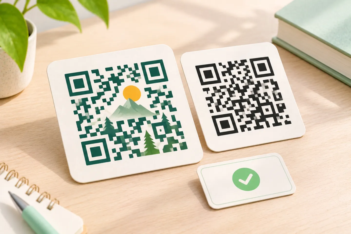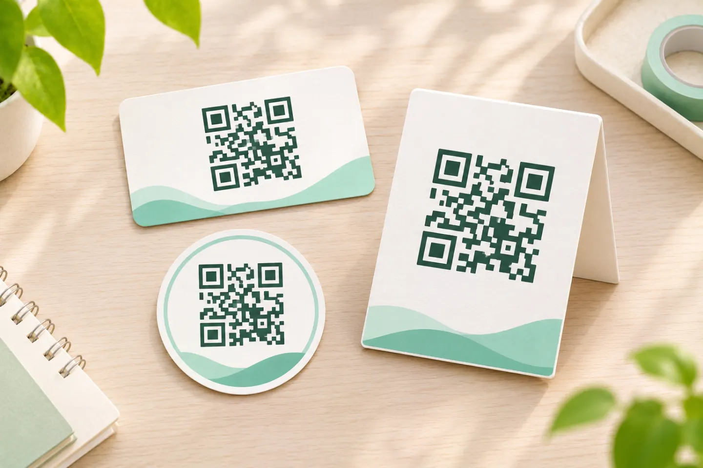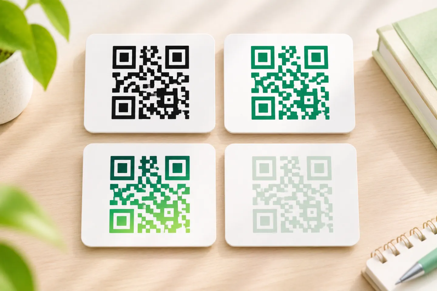


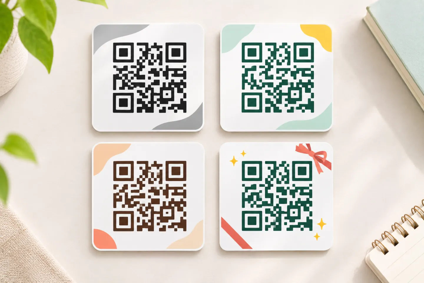
The QR code design ideas below are suggested layouts—not tested templates or guarantees of scanning performance. Choose one for the task, then check the finished artwork in its intended setting.
Five QR code layouts and where to use them
1. The minimal product-information label
Suggested layout: Put a black QR code on a plain white panel. Add a short heading such as “Product instructions” above it and “Scan for setup steps” below it, outside the clear border.
Use this as a starting point for manuals, product inserts, or consumer-information packaging. Keep ingredients, promotional graphics, and other copy outside the code’s reserved space.
For transparent packaging, specify an opaque white backing rather than letting the contents become the background. GS1 recommends this approach because changing contents and irregular backgrounds can interfere with readability. Reflective materials also need special attention; a matte black code on white is its recommended starting point. [2]
Retail boundary: A marketing link is not automatically a checkout barcode. For QR Codes powered by GS1 during dual-marking, GS1’s design guidance places POS-intended QR codes within 50 mm—about 1.97 inches—of the linear barcode’s center, while preserving both quiet zones. Consumer-engagement-only codes may be on another panel. These are retail-specific instructions, not universal rules for every QR label. [3]
2. The bold poster card
Suggested layout: Place the code inside a white card over the poster’s artwork. Use the brand color for the card’s outer frame and add one direct instruction: “Scan to register” or “View event details.”
Keep the decorative frame beyond the quiet zone. Give the code its own area rather than laying it over a photograph.
Before choosing the final size, mark where viewers will stand and test from there. Do not assume a business-card-sized symbol will suit a window poster. DENSO WAVE explains that readable size depends on module size and scanner capability, so there is no single physical size suitable for every application. [4]
3. The menu or counter-service panel
Suggested layout: Use a simple white rectangle, a black code, and a specific caption such as “View the lunch menu.” Place the restaurant logo above the panel instead of over the code.
For a table tent, leave room around the whole panel and keep it away from the fold. Add a readable alternative address or a brief instruction for requesting a menu without scanning.
Treat the assembled table tent—not just the design file—as the item to approve. Test it where customers will use it, including under the venue’s lighting. If you laminate it, include that finish in the test.
4. The restrained brand-color treatment
Suggested layout: Try dark navy modules on white, with a matching navy caption. Alternatively, keep the code black and use brand color only in the surrounding layout.
Colored modules are not automatically unsuitable. GS1 lists dark blue, dark green, and dark brown among preferred dark-module colors. Black and white remain a conservative starting point; avoid gradients that weaken contrast. [2]
Be particularly cautious with red modules for retail: red-light POS scanners may not distinguish them from a light background, even when a smartphone can decode the code. A phone scan therefore does not establish POS suitability. [2]
5. The screen-ready action card
Suggested layout: Put the QR code beside a short explanation and a normal clickable link or button leading to the same destination. Use a plain light panel behind the code.
For a website or digital document, make the link the direct-action option rather than requiring everyone to scan. If the QR image itself is a link, give it a text alternative describing its purpose, such as “Open the event registration page.” W3C guidance says functional-image alternatives should identify the action, not merely describe the image. [5]
Review the final published page or uploaded graphic at its actual display size. Include any platform resizing or compression in your scan checks.
Technical boundaries to preserve
Keep a four-module quiet zone
For a conventional QR Code, reserve a clear border at least four modules wide on every side. A module is one small square in the pattern. DENSO WAVE describes this margin as an area where nothing is printed. [6]
For example, if each module is 0.5 mm wide, reserve at least 2 mm of clear space on each side. This is a margin calculation, not a recommended module size. Keep captions, frame strokes, icons, and background textures beyond that border. GS1 explicitly places calls to action outside the quiet zone in its GS1 QR design guidance. [6]
Leave the pattern undistorted
Resize proportionally. Do not stretch the code into a rectangle, crop its edges, or redraw modules as decorative shapes. GS1 warns that changes to module shape and grid uniformity can impair performance. [1]
For production artwork, request an export that preserves clean module edges and the quiet zone. Inspect the placed asset after layout—not only the original download.
Put the logo beside the code when possible
An embedded logo covers information. GS1 treats inserted images as damage recovered through error correction; their size and placement can cause decoding failure. “Small and centered” is therefore not a guarantee, and this article does not prescribe a universally safe logo percentage. [1]
Our recommendation: place the logo outside the code first. If an embedded mark is essential, retain a plain version as a comparison and require additional checks before approving it.
A practical approval workflow
- Confirm the task. Write down the destination, audience, viewing position, and whether the code serves consumers, POS equipment, or both.
- Build the plain version first. Reserve the quiet zone before adding frames and captions.
- Check the destination. Decode the code and confirm that the expected page or action opens.
- Test the finished output. Use the actual print size and material, assembled packaging, or published screen graphic—not an enlarged preview.
- Check intended conditions. Try representative phones, lighting, angles, and viewing distances. For POS use, include the intended retail equipment and verification process.
- Simplify if results are inconsistent. Remove embedded artwork, restore a plain background, or increase the symbol size, then repeat the checks.
These are recommended preflight steps, not tests performed for this article. For modified GS1 retail barcodes, GS1 calls for verification of each unique barcode against ISO/IEC 15415 and the relevant symbology standard; informal phone checks do not replace that process. [1]
References
[1] GS1. 2D Barcodes at Retail Point-of-Sale Implementation Guideline, Release 1.1.0, December 2025, especially sections 4.6.5 and 5.7.2 — https://ref.gs1.org/guidelines/2d-in-retail/
[2] GS1. GS1 2D Barcode Colour & Quality Guide, Release 1.0, February 2025, especially sections 2.4, 3, and 3.1 — https://ref.gs1.org/docs/2025/GS1-2D-colour-guide-i10-f-25-02-10
[3] GS1. QR Codes powered by GS1 design guidelines, Version 1.1, October 2024 — https://assets.ctfassets.net/9uypwcnuzbqi/5tdVjyVX7zyEgOrvxiG1Ov/981cd49e750e2d24539ef0279f41ac9d/24GSGL0599_D01_QR_Brand_Guidelines_V1-1_External.pdf
[4] DENSO WAVE. Point for setting the module size. — https://www.qrcode.com/en/howto/cell.html
[5] W3C Web Accessibility Initiative. Functional Images. — https://www.w3.org/WAI/tutorials/images/functional/
[6] DENSO WAVE. Point for determining the code area. — https://www.qrcode.com/en/howto/code.html