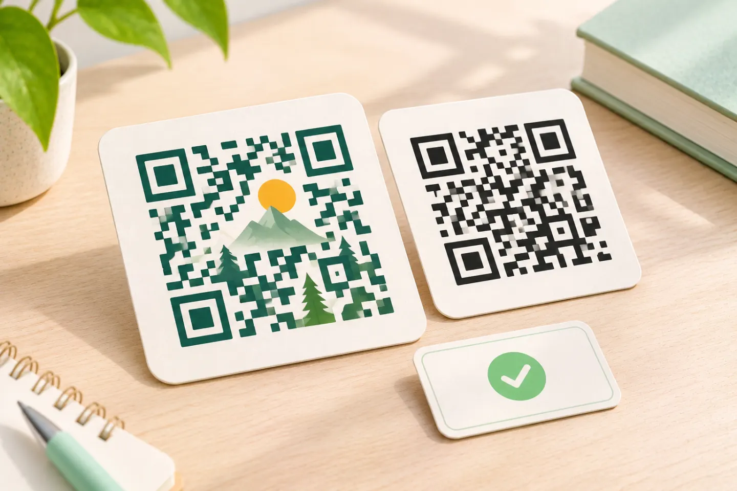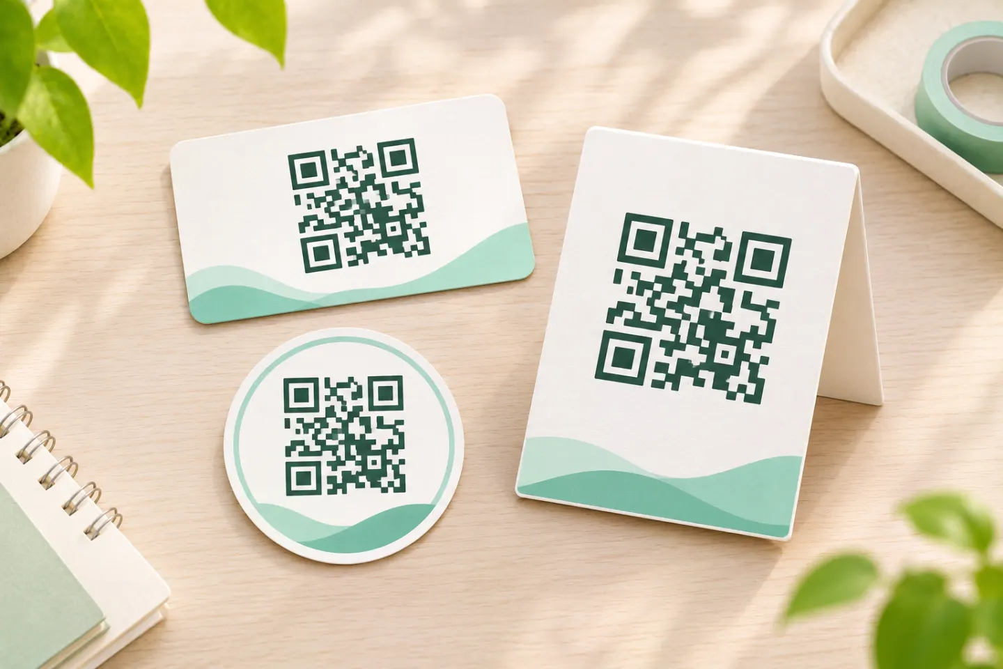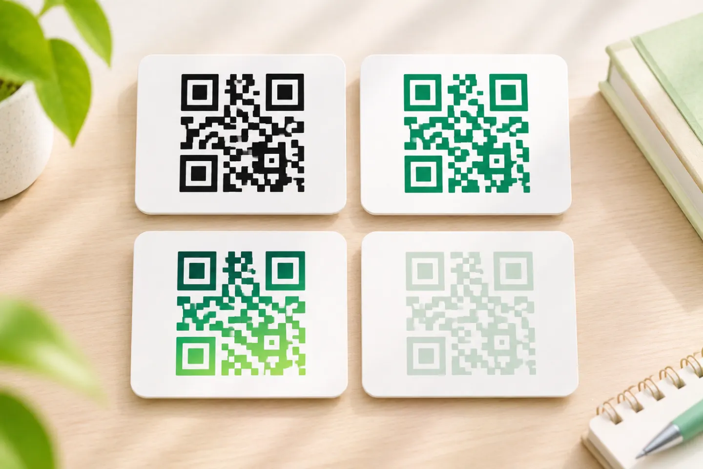


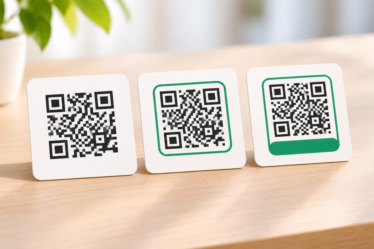
Treat the frame as optional and the explanation as essential. Nielsen Norman Group notes that QR symbols do not reveal their destination or purpose on their own; nearby context must do that work. A frame is one way to group that context—not a substitute for it. [2]
Separate the frame, the CTA, and the quiet zone
For this guide, a frame means the optional border or label panel around a QR code. The CTA is the nearby wording explaining the action, such as “Scan for setup instructions.”
The quiet zone is different: it is the clear margin needed around the QR symbol. DENSO WAVE specifies a four-module-wide margin on all four sides of a standard QR Code. A module is one small square in the code’s grid. Keep borders, letters, arrows, and other artwork outside that margin. [3]
The practical distinction: design the label around the protected code area, rather than squeezing the code into a decorative badge.
Write the CTA around the actual next step
Use this editorial starting point:
Scan to + specific action or resource
Then compare the wording with the destination. NN/g recommends linking directly to the relevant page or action rather than sending someone to a generic homepage after promising something specific. [2]
Adapt these QR code CTA examples
These are suggested copy options, not tested conversion winners.
| Placement | Suggested CTA | Destination to prepare |
|---|---|---|
| Event flyer | Scan to register for the workshop | That workshop’s registration form |
| Restaurant table card | Scan to view the menu | The current menu |
| Product insert | Scan for setup instructions | Instructions for that product model |
| Retail display | Scan to see available colors | The featured product’s color options |
| Visitor sign | Scan for the building map | A mobile-readable map |
| Presentation slide | Scan to give feedback | The relevant feedback form |
“Scan here” describes an interaction but leaves the outcome unstated. Prefer wording that names the task, following Penn Medicine’s recommendation to communicate clear purpose and value. [1]
Keep the promise accurate
Before approving the copy, ask:
- Does “register” open registration, or only an event description?
- Does “download the guide” actually offer a download?
- Is “today’s menu” maintained frequently enough to justify that wording?
- Does the task require an account or a particular app?
If a specific app or device is required, disclose it nearby. NN/g recommends identifying those requirements when necessary. [2]
Design the frame around the message
Start with a plain layout
Try a readable CTA above the code, the code on a solid white panel, and a short fallback web address below it. Illinois Extension recommends black on white, an undistorted symbol, a CTA, and a short URL on the document. [4]
Add a border only if it serves the layout. If it forces smaller wording or less room around the symbol, remove it. There is no need to make the frame visually elaborate.
Preserve the full clear margin
Do not place “SCAN ME” inside the code’s white margin or let a frame line touch the outer modules. Measure the quiet zone from the symbol’s outer edge—not from the edge of the exported image, which may already contain padding. Apply DENSO WAVE’s four-module margin on every side. [3]
Avoid treating one size as a guarantee
Illinois Extension recommends a code at least one inch wide for its communications materials. That is an institutional recommendation, not proof that a one-inch code will work in every placement. Its guide also asks designers to consider where the piece will be placed and where people will scan from. [4]
For your project, reserve enough space for the code, its clear margin, and readable copy, then test the finished layout under its intended conditions.
Add a way to proceed without scanning
For printed materials, include a short, working web address near the code. The Department of Energy recommends a shortened link below printed QR codes and adjacent text identifying what the code links to. It also advises placing signage where people using wheelchairs can scan it. [5]
For a web page or email, offer an ordinary clickable link rather than making the QR code the only route. Penn Medicine advises against QR codes where a hyperlink can navigate to the resource. This does not rule out cross-device uses, such as a presentation viewed on another screen. [1]
Check the finished piece before publishing
Use this recommended production checklist:
- Compare the CTA with the destination. Confirm that the promised task is available immediately.
- Inspect the exported artwork. Check for cropped margins, overlapping borders, and distorted code shapes.
- Test the final output. For print, use a proof at the intended size and on representative material—not just the source image on a monitor.
- Try representative conditions. Check the expected viewing distance, lighting, placement, and more than one phone where feasible.
- Complete the task. Follow the scan through to registration, instructions, or the other promised resource.
- Type the fallback address. Confirm that it reaches the intended content too.
DOE explicitly recommends mobile-phone testing; Penn Medicine recommends mobile-friendly destinations. The broader checklist above is an editorial production recommendation, not a report of tests performed for this article. [5]
The bottom line
Start with a specific, truthful CTA. Add a simple frame only if you want it for the layout, keep all decoration outside the required quiet zone, and provide a fallback address. These choices follow published guidance on context, clear margins, and alternate access; they do not establish a guaranteed increase in scans. [2]
References
[1] Penn Medicine, “Use of QR codes” — https://web-standards.pennmedicine.org/technical-standards/use-of-qr-codes
[2] Nielsen Norman Group, “13 QR-Code Usability Guidelines” — https://www.nngroup.com/articles/qr-code-guidelines/
[3] DENSO WAVE, “Point for determining the code area” — https://www.qrcode.com/en/howto/code.html
[4] University of Illinois Extension, “QR Codes Best Practices Guide” — https://extension.illinois.edu/sites/default/files/qr_code_guidelines.pdf
[5] U.S. Department of Energy, “QR Code Standards and Best Practices” — https://www.energy.gov/cmei/communicationstandards/qr-code-standards-and-best-practices