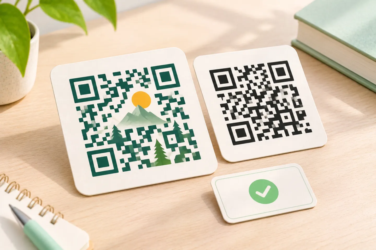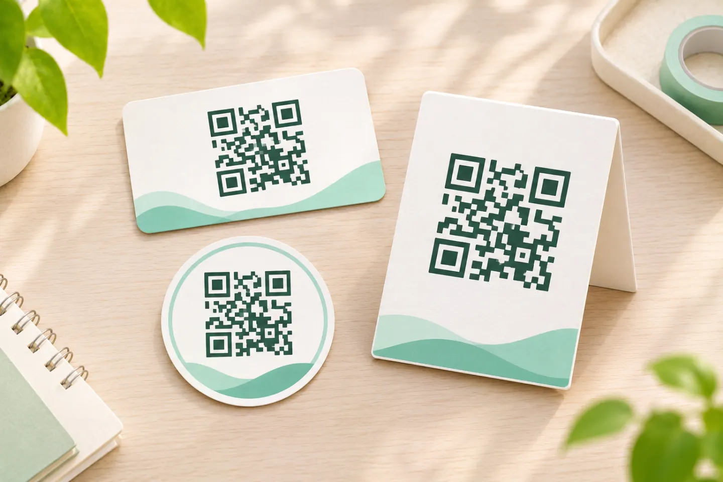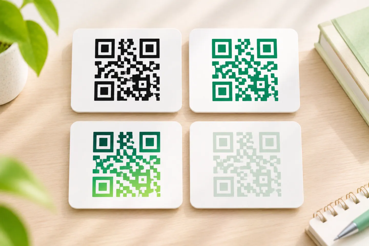


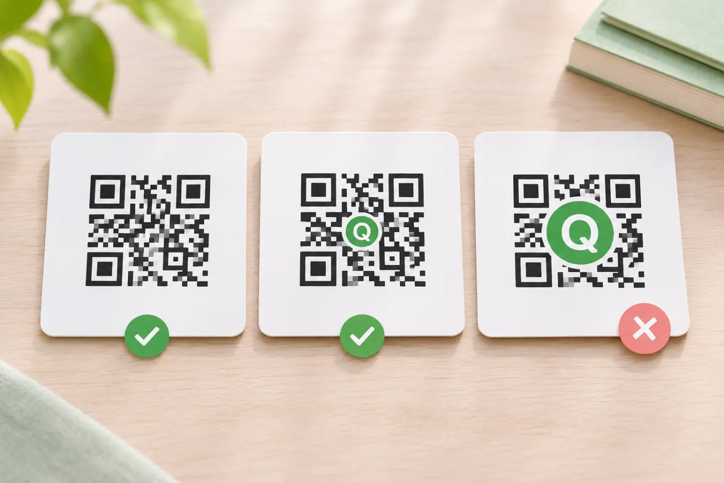
For a conservative starting design, use a small logo, high error correction, dark square modules on white, and an untouched outer margin. The workflow below explains the limits and provides a practical testing checklist.
What a logo changes
A logo covers parts of the encoded pattern. GS1 describes this as intentional barcode damage: error correction may recover the information, but doing so leaves less tolerance for additional damage. Importantly, error correction cannot compensate for disruption to essential fixed patterns, such as locating and clocking features. [2]
QR codes are structured symbols, not freeform graphics. ISO/IEC 18004:2024 specifies their encoding, dimensions, error-correction rules, decoding algorithm, and production-quality requirements. A logo is not evidence that a modified symbol meets those requirements. [3]
How to make a QR code with a logo
These are tool-independent steps. Generator controls vary; this guide does not assume a particular QRHyper interface or feature.
1. Generate the code before decorating it
Enter the intended URL or other content, generate a plain code, and save that version as your comparison baseline. For a web link, confirm the destination is correct before adding the logo.
Recommended workflow: keep the original payload and design settings in your project notes so you can reproduce the code when revisions are needed.
2. Start with high error correction—but understand the trade-off
If your generator lets you change error correction, compare the logo design against the original plain symbol at its final printed size. DENSO lists approximate restoration capabilities of 7%, 15%, 25%, and 30% of codewords for levels L, M, Q, and H respectively. H does not mean you can safely cover 30% of the image. The percentages describe codewords, not a permitted logo area. [4]
Higher error correction adds redundancy and can require a larger symbol. If you keep the finished image at the same physical size while increasing its module count, each module becomes smaller. Recheck the final size rather than assuming that raising the setting fixes the design. [4]
3. Add a small logo without treating the center as a safe zone
Start with a compact, simplified mark. Include any white backing plate, border, or padding in the area you are evaluating—not just the colored artwork.
Do not cover the three large corner finder patterns. Centering a logo does not automatically protect all essential structure: a badly positioned overlay can still prevent decoding. GS1 warns that oversized or misplaced logos can cause failure. [5]
There is no universal safe logo percentage established by the official guidance reviewed here. The practical recommendation is to begin small, compare against the plain version, and reduce or remove the overlay if results deteriorate.
4. Preserve the quiet zone
A standard QR code requires a clear margin four modules wide on every side. A module is one small square in the QR grid. Keep text, frames, background artwork, and adjacent graphics outside that margin. DENSO explicitly defines the quiet zone as an area where nothing is printed. [6]
Check this again after placing the exported code in your page layout: do not crop away its white border.
5. Keep the underlying pattern conservative
Use black modules on a white background as your baseline, preserve square proportions, and avoid stretching or reshaping the grid. GS1 warns that altered module shapes and warped grids make reading harder. Its warning about red, orange, and yellow dark modules specifically concerns barcode equipment that often uses red illumination; it is not proof that every phone camera rejects those colors. [5]
For branding, consider putting the logo beside the code, outside its quiet zone, instead of over the data.
What the GS1 logo test shows
GS1’s February 2025 color and quality guide shows one logo design failing verification at L and M, receiving a marginal failure at Q, and passing at H. However, the QR version and physical dimensions also increase across the examples, while the logo diameter stays approximately 16 mm. This is not a controlled demonstration that changing ECC alone guarantees success, nor a reusable logo-size rule. [2]
The useful takeaway is narrower: evaluate the complete symbol, including its size, structure, overlay, and error correction.
Test the finished layout before publishing
The following is a recommended acceptance checklist, not a report of tests performed for this article:
- Compare plain and branded versions. Use the same content and intended output size. Record failures and repeated attempts, not just one successful scan.
- Use representative devices. Include iPhone and Android models your audience is likely to use, and their normal scanning paths. Apple officially supports scanning through Camera or Code Scanner; that does not certify a particular logo design. [7]
- Test the actual output. For print, use a proof at the intended size and on the intended material. For digital use, check the published layout rather than only the generator preview.
- Try expected conditions. Include realistic distance, angle, lighting, and reflections.
- Check the destination separately. Open the result and confirm the intended page and action, not merely recognition of a QR code.
- Retest after revisions. Include changes to the logo, payload, size, colors, export, and layout.
If the branded code performs worse, first remove or shrink the logo. Then review contrast, sizing, and the quiet zone before repeating the comparison.
When to leave the logo outside the code
Our editorial recommendation is to keep the symbol unmodified when space is tight, conditions are demanding, or scan failure would have serious consequences.
For retail use, phone scans are not a substitute for barcode verification. GS1 says consumer devices and point-of-sale hardware can behave differently, and calls for verification of modified symbols against the applicable quality and symbology requirements. [5]
Bottom line: make branding secondary to scanning. Start conservatively, preserve the required structure and margin, and approve the finished output only after testing it in its intended use.
References
[1] DENSO WAVE — QR Code FAQ — https://www.qrcode.com/en/faq.html
[2] GS1 — 2D Barcode Colour & Quality Guide, February 2025, section 4.2 and Table 4-2 — https://ref.gs1.org/docs/2025/GS1-2D-colour-guide-i10-f-25-02-10
[3] ISO — ISO/IEC 18004:2024, public abstract and publication information — https://www.iso.org/standard/83389.html
[4] DENSO WAVE — Error Correction Feature — https://www.qrcode.com/en/about/error_correction.html
[5] GS1 — 2D Barcodes at Retail Point-of-Sale Implementation Guideline, release 1.1.0, December 2025 — https://ref.gs1.org/guidelines/2d-in-retail/
[6] DENSO WAVE — Point for determining the code area — https://www.qrcode.com/en/howto/code.html
[7] Apple Support — Scan a QR code with your iPhone or iPad — https://support.apple.com/en-us/102680